Most ADs don’t work on a lot of presentations – probably because they don’t want to. Some people would rather hide under their desk than deal with presented materials. I realize that I’m weird. I actually like presentations. I think it has something to do with creative restrictions. It’s like trying to paint a mural on an index card. Along the way I’ve picked up a few principles that have helped me. Maybe they will help others as well.
1. Real estate is king.
Too often, people put a lot of stuff on their slides, and while we try to find ways of trimming it, not everyone is on board with spending the time and energy to come up with a simpler and better way of presenting their story. Odds are, your template will need to serve some busy slides.
What does this mean in practical terms? That beautiful background swoosh you love so much is probably costing you too much space on the page. Putting the logo on every page is not just unnecessary; it’s taking away from your usable space. (Besides, they already know who you are – you don’t have to remind them on every page.) Every inch of space on your slide is important, so keep your template to a minimum.
2. It’s best to design with actual content.
A lot of designers will throw together a background and think that’s the template, without ever seeing the content of the presentation. The content and the background should work in support of one another. Actually, it’s best to think of them as a unified whole, not 2 separate things. A template isn’t just a background. Beautiful content on a plain white background can be captivating. And ugly content on the most beautiful background in the world will still be horrible. Think of a template as a system of principles of how the information should look on the page. Just designing a background and maybe indicating where the bullets and title should go all but guarantees a poorly executed presentation.
3. You don’t always know what the room conditions will be.
 Sometimes you’ll have a projector and it will be in a room with big, bright windows. It plays havoc on your design. That nice, rich maroon looks like a dingy gray. And that 40% gray tint that looked great on screen won’t show at all. They won’t even know it’s there. So use more contrast than you think you need, and realize that colors will also shift. Oranges can look like yellow or brown or even red, for example. The whole idea of “color-management” in presentations isn’t so much of a myth as it’s just a really good joke.
On the other hand, if you present on a Plasma TV, you may find your colors become even more saturated. Certain Reds and Purples can really go too far if you’re not careful.
Bottom line: try to split the difference. Play it safe. Saturated, but not too saturated. Lots of contrast, but not too much. Obviously you want to find out all you can about the venue, but it still pays to play it safe.
4. There are the ideal point sizes – and then there is the reality
Again, this is why you want to work with live content, even if it’s only example content. It’ll help you see how much the authors of the presentation are trying to fit on the page. Everyone has heard what the ideal point sizes are for presentations, though many sources disagree as to what those are. But if you are thinking you’ll want 24 points for body copy, you might be surprised if you have to use much smaller fonts to make it all fit. In these kinds of situations, I’ll generally try to have a conversation about simplification, but in the real world not everybody is on board with putting less on their slides. So sometimes you just have to accept too much on the slide and fonts that are too small. Generally speaking, I try to figure out what point sizes I’ll need on some of the busier pages, then use those throughout the presentation. A system of consistent point sizes is the mark of a well-designed presentation.
5. The safe fonts to use, and how to get some that are better.
If you can’t determine who is presenting or working on the presentation, you have to stick with the safe fonts, which are super ugly. Calibri, Tahoma, Arial, etc. PowerPoint has only a very limited ability to embed fonts, and if the person on the other end doesn’t have the right font, it’ll look even uglier than the safe fonts. So try to spare yourself this fate. Find out how the presentation is being presented, worked on, and distributed. If you can determine how the file will circulate, you can ensure everyone who needs it gets the font. And then you have a much larger palette of fonts to choose from. Better fonts make a huge difference.
6. Ask about the aspect ratio.
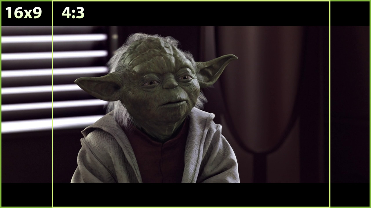
It used to be that the standard presentation ratio was 10” wide, by 7.5” tall (4×3 aspect ratio). I have found that for bitmaps, 150dpi works best.
But these days there are more options. Most everyone’s computer has a widescreen display, and many presentations are done on plasma or LCD TVs. But this can mean either 16×10 or 16×9, which we set up in PowerPoint as 10×6.25 or 10×5.63 (but this time we do it at 192dpi). Also, remember that we’re in sRGB. And if they don’t specify, I’ll use widescreen because it just plain looks better.
7. Title bars divide.
Make sure that’s really what you want to do—and make sure that the content supports this choice. Is the title bar the most important thing on the page, and do all the pages really need a title?
8. Think big and horsey.
 (Well unless people are putting too much on the page, which happens a lot.) When you work in Indesign (or Photoshop, or Illustrator, or whatever you like), zoom out a bit when you work on screen to help resist the urge to make things (especially fonts) smaller. Then print it and tape it up on the wall and stand back about 6 feet. It’ll give perspective of what the audience might experience. There are obviously a lot of variables here, but for designers less accustomed to working with presentations, it can be an adjustment to put such large stuff on your page. This can help you get your bearings.
Working with something as limited as presentations can bring out your creativity if you embrace the restrictions. I promise it’s not so bad, and can even be fun at times. You can come out from under the desk now.


