More and more, people are seeing the beauty in a widescreen presentation. If you’re presenting on a plasma or LCD TV, it makes perfect sense. But even projected, a widescreen presentation can really sing. How do you set it up?
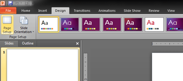
First you have to determine the resolution of whatever your presentation will be displayed on. The most common widescreen aspect ratios are 16×9 and 16×10. So let’s say you’re displaying on a plasma screen that is 1920×1080. That means the aspect ratio is 16:9. (In this case, we divided by 120 to get the number). To set it up on a PC, go to the Design tab and select Page Setup.
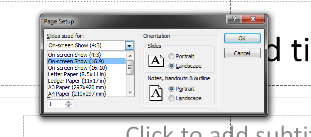
Next, choose the 16:9 preset in the page setup dialog box.
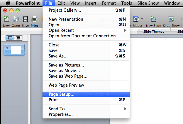
If you are on a Mac, it’s in the file menu:
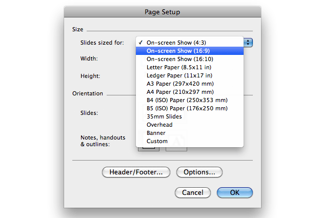
And select whatever size you need
There are a lot of variations on screen sizes and if we really wanted to delve into this more deeply we would need to have a conversation about square vs rectangular pixels, (believe it or not, not all pixels are squares!) but that’s a bit beyond the scope of this article. Let’s just keep this simple for now…
Once you’ve converted your presentation, you may have noticed that any images you might have had in there got stretched strangely. This isn’t difficult to fix. You can either save a separate version of your file before converting it, then copy and paste the images from one to the other (thus keeping them from being distorted). Or you can manually fix them after you’ve done your conversion. More ideally, you’d be already set up in the correct aspect ratio before creating any of your slides and you avoid this particular challenge.
No matter what aspect ratio you choose, be sure to check it on the TV or projector you’ll be using to verify that it works properly and fills the screen correctly, etc.
Easy!


