Designing a presentation in PowerPoint or Keynote is an exercise in swimming upstream. The first thing the program gives you is a title and a page of bullets. Bullets are often the wrong tool for the job, and if your content is well thought out, do you even need a title?
I was having a discussion with an associate the other day, and she asked me why I didn’t put a title bar in a presentation I was designing. “Don’t you think it would set the title apart?” she asked. I agreed that it would set the title apart. And from time to time I do use a title bar, but it’s only when the content, style and function of the deck demands it. But in this case, there wasn’t a need; the page was better without it. (I wish I could show it here, but it was work product and can’t go on a blog.) I explained to her the reason why had to do with letting the design serve the content, not the other way around.
The theory is a simple one: don’t change your content purely because the template demands it. If the template calls for a title, but the slide really doesn’t need it, do you think of one and put it in anyway? Shame! Only put exactly what is needed on any given slide and no more. The slide itself dictates exactly what it needs.
Not every page needs a title
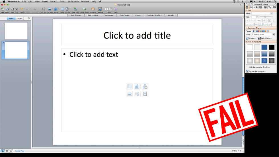
What happens if you don’t need a title, but the template is asking for one? If you give in and write something, you wind up with an abomination like this:
The title detracts so much! Let the content be the star. Let’s fix this quickly before my head explodes
The ideal: A page with unity
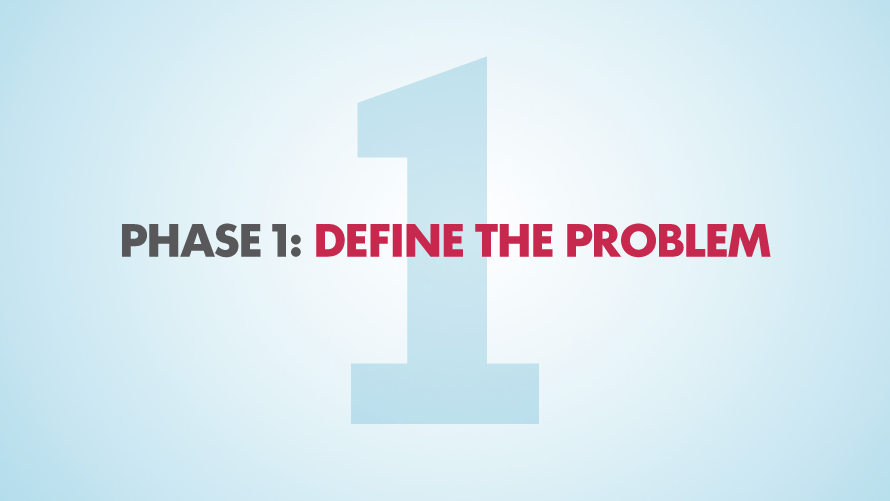
Part of the issue with a title bar is that it treats the rest of the page as a separate thing. It makes the content sit under this overhang. There is no unity between the title and the rest of the page. Better to think of it as a single thing. Here we have an example of a page with unity. There is no division between title and the thing below the title. It’s just the thing.
Imagine putting this text in a title bar! What would fill the area below it? Worse than that, imagine the content sitting in the middle of the page with an empty title bar above it. I don’t even want to show an example of what that would be like. My head hurts. Let’s just move on.
But on some pages there is a role for the thing in the body and a role for the title. For example, this map needs a title for context.
Without the title, it’s meaningless. But if we put the title into a bar, it detracts from the map. It makes the map seem secondary.
The title bar above the map is bad, but not terrible. There are things we could do to improve the design, but it proves the point well enough. But what would happen if the next page after the map didn’t need a title?
So logically we would delete the title bar, but it’s a bit jarring to see it disappear from one page to the next. So that’s no good either.
Bottom line: What I want is the option of having a title when a page needs it, not having one if a page doesn’t need it, and to avoid the awkward transition between them.
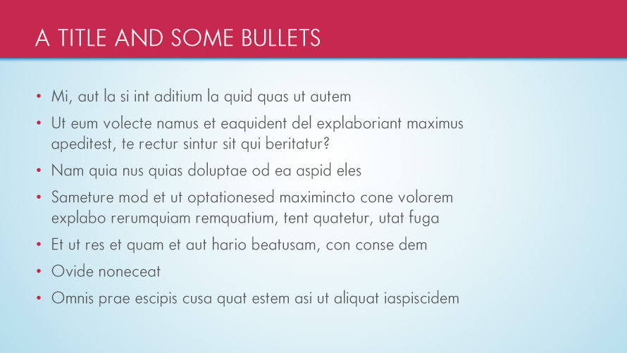
Really, the place where a title bar makes the most sense is in a presentation with a lot of bullets – more of a document, really.
This is more of a document than a visual aid, but it proves the point, albeit circuitously. A title bar establishes a strong sense of hierarchy. It doesn’t make the page unified in any way; it divides. In a document, that can work. If you have a slide where the title actually is far more important than the content, it can work. But not every slide is like that. Ideally, most slides would have a harmony where all things work together to strengthen the whole. A title bar dominates the page and makes everything else of secondary importance, whether it should be or not. Do you really want to commit to that on every single slide of your presentation?
Me neither.
