I sometimes think my co-workers think I’m crazy. I try hard to make presentations look like anything but presentations. Or, more to the point, not look like typical, ugly presentations. It’s an uphill battle – some people don’t see the point in the process, though generally most people appreciate that the end product does end up looking a lot better than where they started. But there are reasons to do this, and basic principles that can get you there.
People ask me to lay out pages with circles all the time, and it occurs to me that there really is a right way to do it. So let’s look at one such example and see if we can make sense of the theory and the practice. This will have lots of screen caps, a couple of technical things to know, and an overall explanation of my thinking.
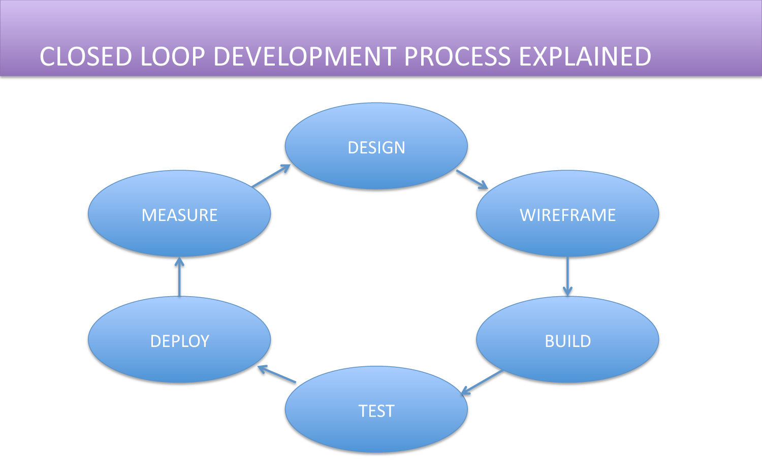
Before we start working on this, let’s first decide if the circles are even appropriate. In this case, it’s a cyclical process. The circles make sense. In fact, if you were to put them in squares, it would be weird. So let’s assess what we have here and figure out how to make it better.
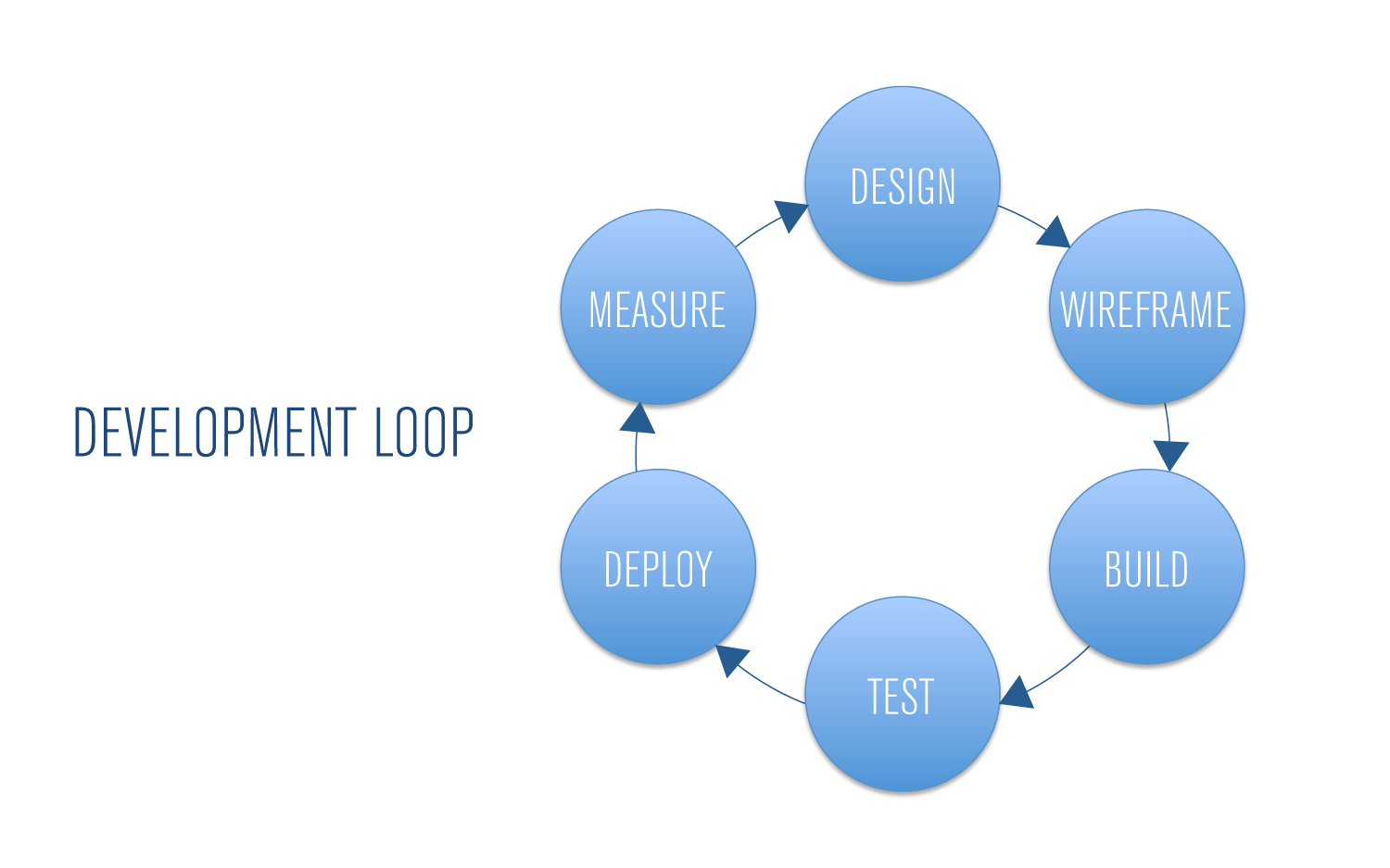
I’m not a fan of the title bar – I often don’t use title bars in my presentations because of the hierarchy it forces on the page. The ovals aren’t good, and the use of color is a bit difficult on the eye. The page has that standard “crappy PowerPoint look.” The title itself isn’t well written, and the arrows don’t look good. What’s good about it? Well, the content in the circles is concise, which is really the only way it can work. Too much content in circles becomes very hard to read.
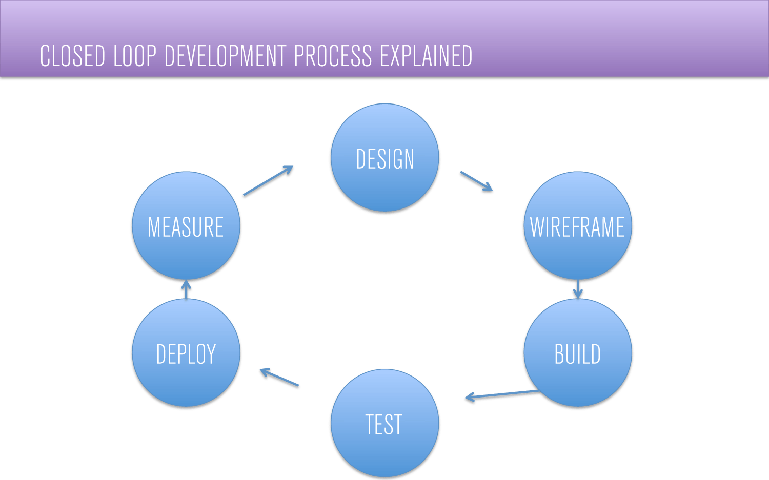
The first thing we’re going to do is use a better grade of font. A compressed font will allow us to better use our space, and will improve the overall visual. In this case, we’ll use Akzidenz Grotesk Light Condensed.
Circles vs Ovals
I’m usually not a fan of making design decisions based upon personal preferences. In my mind, there should be a solid reason behind every design decision you make; and the reason should be functional. But ovals are an area where I tend to put my foot down. I try to make them circles whenever possible unless there is some aspect to the design that specifically makes the ovals work. The reasons have less to do with design functionality and more to do with what we’ve grown accustomed to when we see bad presentation design. People use ovals because it’s easier to fit more content on the page. Circles limit the amount of words you can use. So we see TONS of ovals in presentations. It has that typical “PowerPoint look.”
This, by the way, is one reason (among several) that I tend not to use the standard quick styles in favor of doing more local formatting and design. The quick styles just look like typical, boring PowerPoint, and give the impression that you don’t particularly care about your design.
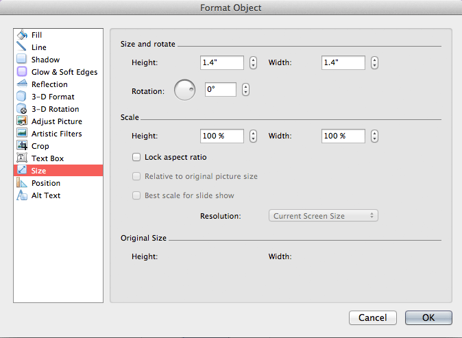
Anyway, in an attempt to make it look less typically like PowerPoint, we try to make them circles. So let’s make these 1.4” height and width. I guess you could say that there are also aesthetic reasons for using circles over ovals, but the functional reason is usually the one I find most compelling.
But now that we have them in circles, the text is wrapping weirdly.
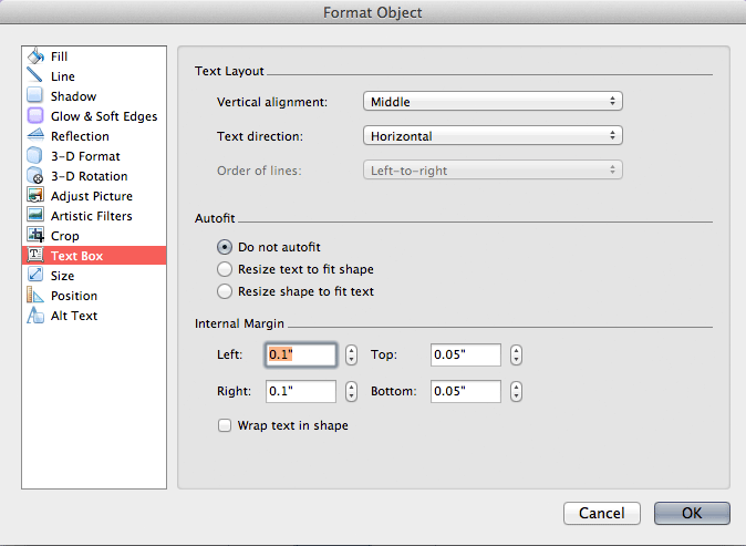
It looks like the text should fit, but it doesn’t because you’re in a circle, not a square. You could reduce your left and right margins, but I prefer a different approach. I turn text wrapping off and make sure that Autofit is off. In situations like this where the circles only contain a single word, that fixes the problem completely. If the text is multi-line, you’ll have to manually break the lines (shift+return).
Remember, though, that putting too much copy in circles makes them much harder to read. This only works if you keep it to just a few words in each circle. If you have more words than that, you’re using the wrong tool for the job, and you’re likely confusing your script with your visual aid. Keep it simple.
So that fixes the wrap. We’ll get to the Quick Style fill in a moment, but first, let’s think of a better way to handle the title. It doesn’t really belong in a title bar because it’s not that much more important than the content in the circle, which is really the point of the page. Since we’re dealing with circles, we’ll be able to carve out plenty of horizontal space. Let’s try to unify the title and the content into something more cohesive. Also, the title itself isn’t well written. Let’s tighten up the language while we’re at it.
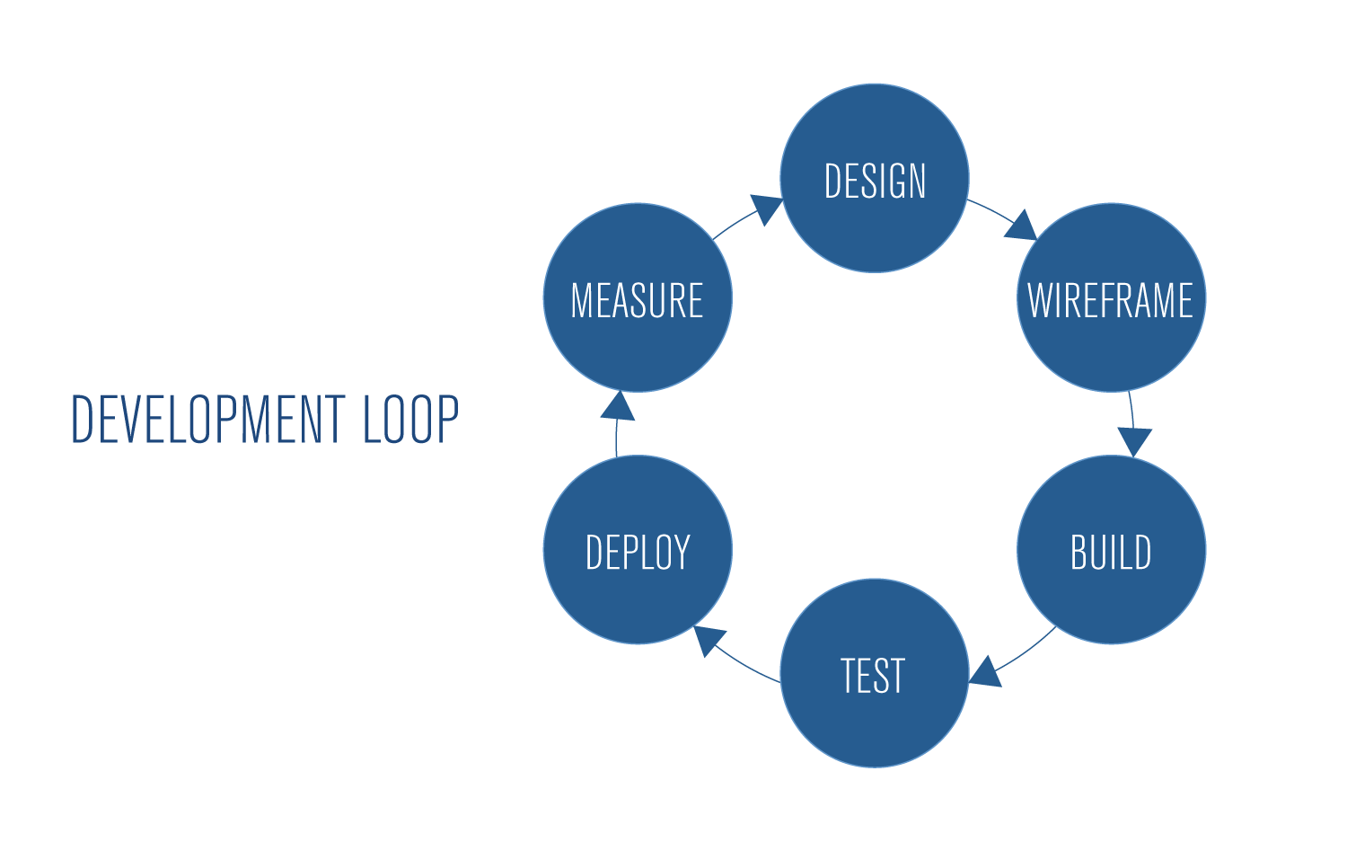
So now let’s try moving away from the Quick Style. The shadows and gradient of the Quick Style don’t really have a purpose, so let’s try eliminating them, and putting forth a little more contrast.
I am your DENSITY!
 Now we have a page where everything exists for a reason, but it’s a bit generic. Beyond that, we have a small problem with density. Density in design has to do with how much ink you put on a page (or color on a screen), relative to the thing you actually want them to pay attention to. In this case, the dark blue is a little overpowering of the words and it’s hard for the eye to know where to go. We want contrast in our designs, but the circles are more dominant than the words. Let’s soften this up a bit. What if we tried a lighter background, but not stark white, and let the circles sit above?
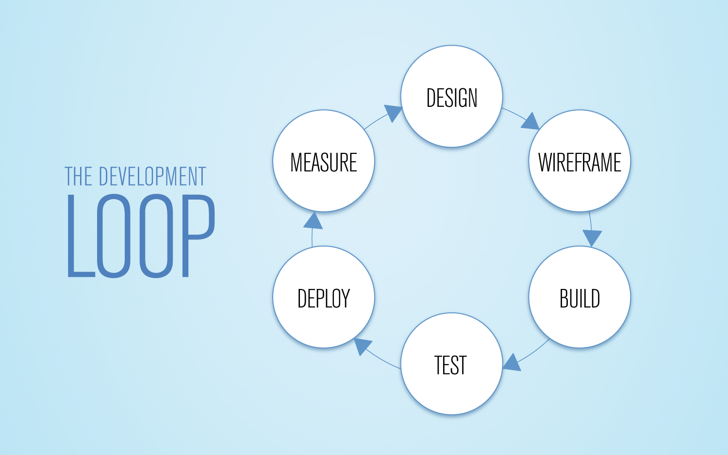
Now a shadow has a purpose (to separate the white from the light blue), and the content inside the circles is drawing your attention instead of the circles themselves. Much better density.
In a final presentation we could animate this to help people see the cycle more clearly, but already we’ve taken a typical cycle chart and created something functionally and aesthetically better. The circles (instead of ovals) make the page much easier to read, and we’ve moved away from the typical “PowerPoint look.” Good stuff all around.

