

The other day I bumped into a colleague I had worked with at another agency. We got to talking about the first project we partnered on. It was a slide presentation – a really bad one, as I recall, and I kind of put my foot in my mouth.
I remember it clearly. We were looking at the slides, and he got animated. “I know what to do here,” he said, as he proceeded to sketch out his solution. Things needed better alignment, a better sense of space, hierarchy, etc. And I had to agree. He wasn’t making bad choices at all. But what he didn’t do was question the content, or try to understand what it meant. Finally, I said, “Before we decide how to lay out what’s there, maybe we should decide if it belongs there in the first place?”
He looked at me like I had three heads. In his mind, what was on the slide was staying on the slide. I could have been more tactful, to be sure. But his is actually a fairly common approach. To try to create layout solutions to story problems. Most designers start designing without a thorough understanding of what the thing they are designing really means. And part of it is being willing to rock the boat and question the story from the ground up. Good design requires a sense of context.
Don’t worry, this happens all the time
Most designers treat what’s on the page as gospel. But the thing is, slides are usually a first draft, or at best, a first draft that’s been slightly tweaked. They assume that whatever is on the slide is what they have to work with – and it’s often rough. Lots of the content we find on slides doesn’t support the big idea, and lots of it should be spoken by the presenter, not written on the slide. Understanding what it means has benefits, though. For example:
1. You often see a better way of presenting or designing the information, but this is only possible for someone that really understands the story
For example, Here is a heavily sanitized slide:
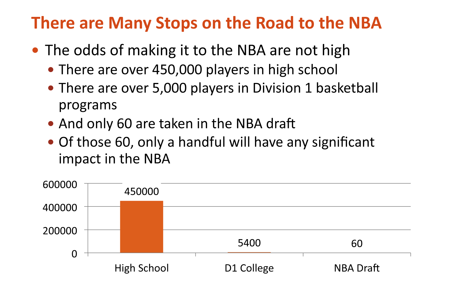
So lets read it and see what it means. This is about the statistical odds of a young basketball player making it to the NBA. Once you understand it, you see that there is a better way of presenting the information. What I would do would be to first show the slide with 3 basketballs of relative size, like so:

But the 2 smaller basketballs are so small that it’s difficult to ascertain their relative size. So we could, on a click, add a magnifying glass to dramatize the point, as well as better show the sizes of the 2 smaller basketballs. But this kind of redesign can’t happen if you don’t understand the material and it’s context within the larger story. Here’s the build with the magnifying glass:

2. Understanding what it means makes you realize that a lot of what’s on the page doesn’t need to be there. That it should be spoken by the presenter or left off entirely
3. You spot when they are giving facts instead of telling stories – and expecting the audience to connect the dots. You want to focus on a simple, powerful idea that is, for lack of a better word, “summarized.” Be clear on what your big idea is, so your audience can be clear too.
4. You start to see where the information is relevant to the audience and where it isn’t. If it doesn’t support the big idea, it doesn’t belong
The question to ask
The first question to ask isn’t “does this belong here?” That’s weeding out the garden, instead of tilling and replanting. The question to ask is, “what is the big idea?” What’s a win in this presentation? How are we positioning ourselves? When you see the big idea, it becomes immediately obvious if the details fit or not. And every detail must be chosen because it directly helps you tell the story that wins. How cool the idea is couldn’t be less relevant. Abundant creativity and strong thinking are meaningless if they don’t address the client’s needs. Tell a simple story with only the information you absolutely need.
As I talked with my former colleague, we remembered the first meeting (and many after) and laughed.
“You weren’t subtle,” he remarked.
“I try to be,” I replied, “but rarely am.”
In his case, he was looking at a design problem. And the page, as it existed, had plenty of design problems. But if you understand the information and how it fits in the big picture, you often find the information itself is what needs fixing. Fix the story and the design solves itself.


Aaron,
Good article. I like your thoughts on presentations.