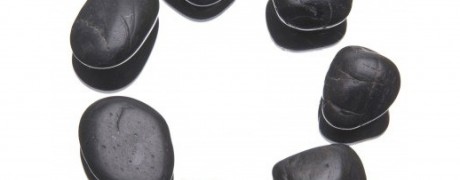
WORKING WITH CIRCLES IN YOUR DESIGN
December 11, 2012
0 Comment
I sometimes think my co-workers think I’m crazy. I try hard to make presentations look like anything but presentations. Or, more to the point, not look like typical, ugly presentations. It’s an uphill battle – some people don’t see the point in the process, though generally most peopl
Continue Reading →FONTS IN POWERPOINT: WHAT YOU NEED TO KNOW
September 03, 2012
Let’s be honest. PowerPoint presentations are often boring, and nearly always ugly. As an art director with an inexplicable interest in presentations, I often tell people that the two biggest things you can do to improve your presentation is to simplify your story, and use a better gr
Continue Reading →HOW DO I MAKE MY PRESENTATION BE WIDESCREEN?
August 23, 2012
More and more, people are seeing the beauty in a widescreen presentation. If you’re presenting on a plasma or LCD TV, it makes perfect sense. But even projected, a widescreen presentation can really sing. How do you set it up? First you have to determine the resolution of whatev
Continue Reading →

