Here’s an equation I spout all the time:
A complicated idea
+ Design
= A better looking complicated idea.
The key to better slides is to look first at the story. Once the story works, the slides design themselves. Here’s a quick case study with lots of screen grabs.
First a plea:
The primary focus of this blog was originally intended to be in the area of design, which is a large part of what I do. But since basically everything I do is confidential or work product, I can’t share any of it. So in an attempt to find materials to do case studies, I scour the web. Those of you that have slides that could use a little love and are willing to share; please send them my way. At the very least, you’ll be helping the state of presentations in general. At best, you get free design. Yay!
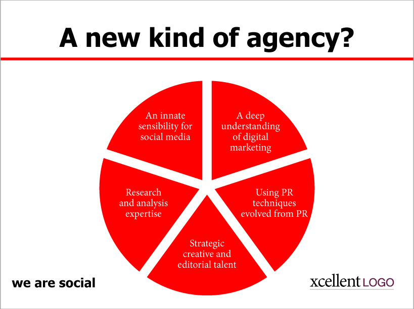
So today I found one on Slideshare that I thought might be a good case study.
So what are our first impressions here?
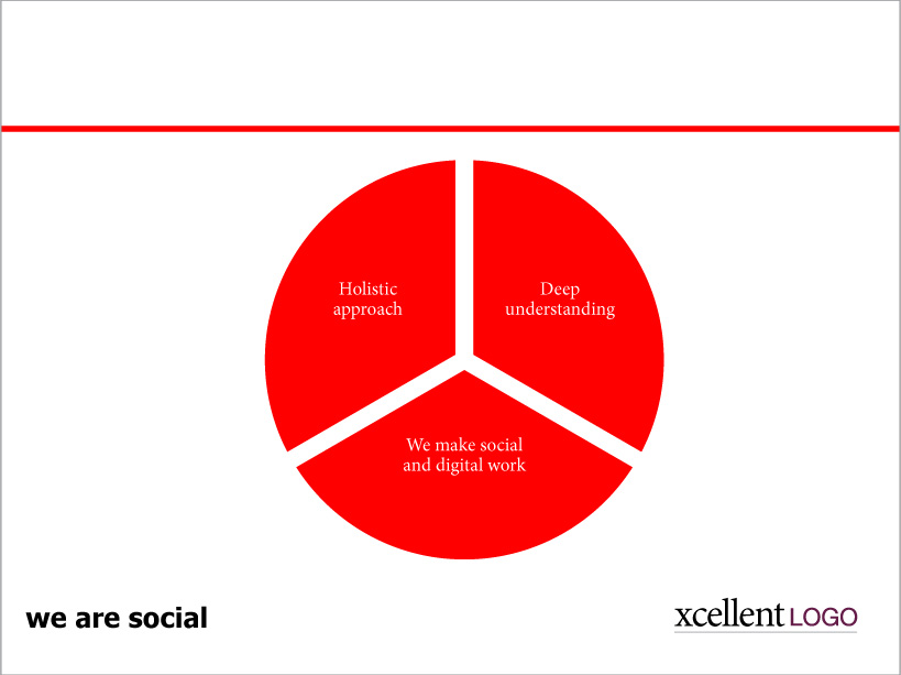
Well, the title is HUGE, but the content in the pie chart is almost unreadable. And it’s not just a question of font sizes. The use of a serif font (look closely you’ll see that it’s Garamond), makes the text even harder to read. And the knockout against red is, frankly, hurting my eyes.
I took a look at this and I saw red!
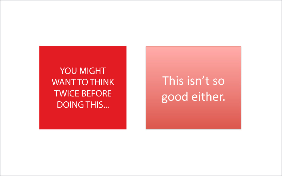
Red boxes on white are tough to look at. The red is so powerful you kind of loose the text.
So we have to be careful about text on this kind of red. It can work, but not like this. To make this sort of red work in any large area, you have to embrace it and work in the negative, not the positive. Think of the red as your neutral. The knock out type becomes what you see. It’s not a look that’s for everyone, but I’ve used it with some success before. Just don’t do it on every page.
But back to our thing here… I’m not sure a pie chart makes a whole lot of sense for this, the copy isn’t doing much for me, and I’m even fixing to tear apart the logo.
So while the copy and design could be improved, the thing that’s at the heart of the problem is the story itself, which is where I usually start.
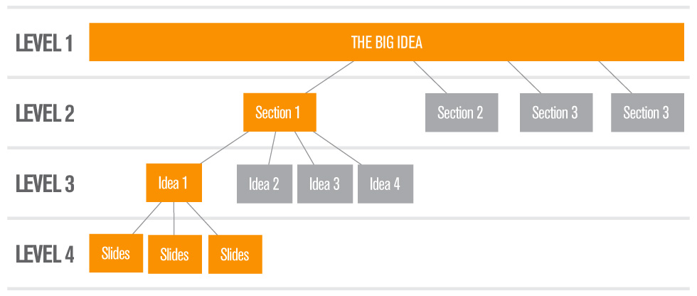
When properly evaluated, a presentation story exists on 4 levels.
In this exercise, we’re only working on the bottom level–the slide itself. So putting aside how this slide works in the larger scheme of things, we are best served by beginning with the question, “what’s this all about?”
The story
What we have here seems like a cross-disciplinary digital/social ad agency putting forth their “why us?” slide. These are usually at the conclusion of your pitch and serve as a wrap up and a way to state in broad concepts why you should get the business. Usually for this kind of thing you want to come up with 3 reasons or take-away points. (Don’t give them too many or they won’t remember any of it). They seem focused on the idea that they are new/different from other agencies, though the question mark in the title doesn’t make me feel like they are completely certain about that (har!).
But you have to ask, are we really saying anything? It seems to me that at this point pretty much every agency understands the importance of social and digital engagement. And there are plenty that do nothing but that. Social and Digital is relatively new, but since everybody is doing it, can they really claim to be a “new kind of agency”? Maybe the question mark truly belongs there because the answer on the face of it would seem to be, “not really.”
So let’s go through the 5 reasons they have in their pie.
“A deep understanding of digital marketing.”
How well you understand it is somewhat relevant to a potential client, but it’s kind of all about you. Is there a way to make this be more about client benefit? What if we said, “We make social and digital work”? That might make a nice close.
“Using PR Techniques Evolved From PR”
This might be useful. Not everyone is framing social media from a PR perspective. But I wonder if maybe the real point here is, “we don’t just do social.”
“Strategic, creative and editorial”
But my guess is they really mean, “we’re not just a bunch of social experts, we bring a more complete range of disciplines.” Let’s call this one, “holistic approach” It seems related to the previous one, so we’re going to merge them.
“Research and analysis expertise”
Meh. What does it add to say that you are experts at research and analysis? Not enough client benefit for my taste – I say we leave this one off.
“An innate sensibility for social media.”
I like the sound of that. You’re selling expertise on this one, and it sure sounds good. Let’s see if we can sex this one up.
Lastly, let’s remember that a slide is not a script. You need to come up with a sense of what you want to say, and let the slide just be a few key phrases or categories. Let your presenters tell the story, and let the slide be a supporting player. And don’t list every reason you can think of. Narrow your list down to the ones that make the most impact on your audience.
Let’s pick 3 things we want them to remember:
- We understand your problem
- We are not just a social agency (which doesn’t differentiate you from every agency, but can be framed as a client benefit)
- We have the ideal solution and are the ideal partners
| Underlying message: | The script could be: | The slide would say: |
| 1. We understand your problem from all angles – and we’re good | We have a deep understanding of your challenges, the marketplace and the most cutting edge techniques | Deep understanding |
| 2. We are not just a social agency | Your message can’t grow in a vacuum – We have a multi-disciplinary, holistic approach that ensures consistent messaging and delivers on the promise of your brand. And it’s proven to work | Holistic approach |
| 3. We are the ideal partner with the ideal solution | We make social and digital work for you, delivering heightened social engagement, globally aligned messaging and a measurable increase in your ROI | We make social and digital work |
;
Finally, let’s kill the title. If you need a title, it could say something like “why us?” but really, we don’t need it. So now we have 3 slices in our pie and a compelling narrative.
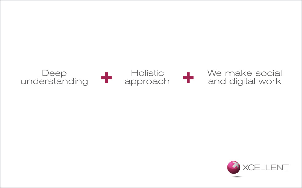
A simplified slide ready for us to work on the layout:
The design
Before I talk about the pie chart, which is really starting to bug me, let’s talk about the logo. What we see on the slide above is a sanitized version of an actual logo, (I only changed the name), but basically pretty much the same as what I found on slideshare. In the real world, you wouldn’t change your logo as you are doing a presentation, but since we’re living in the made-up universe right now I can do anything I want—and I want to change it. In the real world (thankfully we’re not in the real world now!) a logo design would take weeks or even months with tissues, creative reviews, preliminary designs, more reviews, client feedback, focus group testing and a host of other steps. But in this world, we can do it in like 10 minutes. Good enough!
Here’s our new logo:
Next we want to talk about why this is a pie chart. I suppose if you were trying to convey that one reason is 30% of why and another reason is, say 50%, then a pie might work. Maybe. But really, who would do such a thing? So we are killing the pie; it’s the wrong tool for the job.
Next we fix the color. With our wonderful new logo, we now have a color to replace the red in the title bar and the pie chart – this new plum is much more appealing. And we have already eliminated the title; so if we don’t have a title, why have a red rule? We have a new logo, and the title, the rule and the pie are outa here… Happiness abounds!
This leaves us with 3 text boxes. Now I’m starting to get frustrated with the “we are social” tagline on the lower left. Beyond the font, which is too heavy for the other items on the page, I’d like to try saving the tag for the last page. The theory on this is that generally speaking, the more you can eliminate from the page, the better your page becomes. Do we need more words on the page? Usually not. I’m actually a proponent of not putting the logo on every page as well (they know who you are, you don’t have to remind them on every slide), but since I spent nearly ten whole minutes on this beautiful logo creation, I’m keeping it. It’s my world; I’m both the squirrel and the nut. We’re putting “we are social” on the last page, and featuring it more prominently. We’ll get to it in a minute.
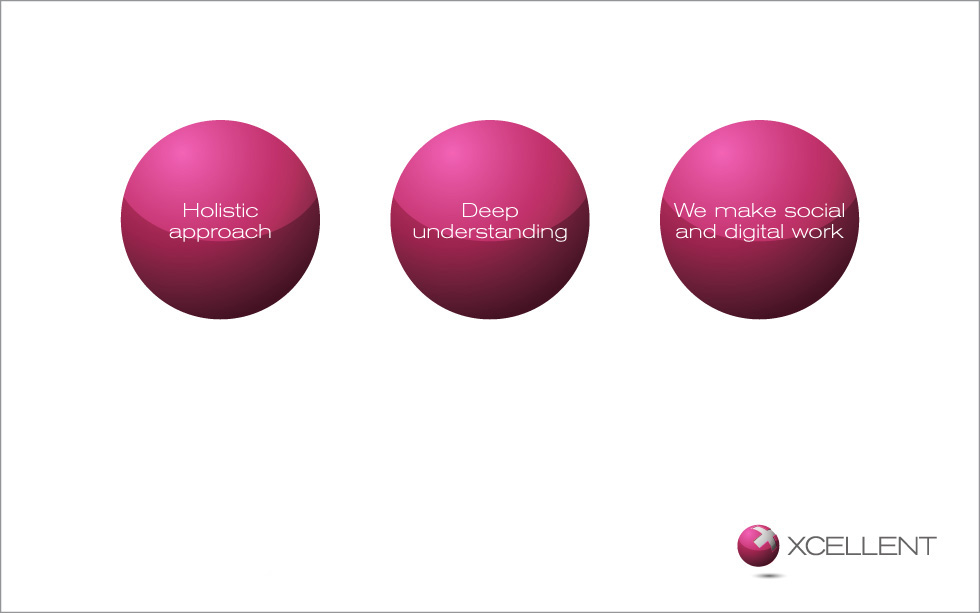
So back to our 3 text boxes: perhaps we could put them in a circle similar to the one in the logo?
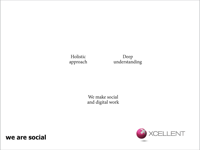
Not bad, but the circles are kind of heavy and totally overpower the text within them. A bolder font might help a little, but it’s still out of balance. Let’s just float the text on the page. The globe of the logo was meant to evoke both the X from the name, and also a plus sign. So let’s use it as a plus sign as a subtle nod in the direction of the logo.
The 3rd text box “We make social and digital work” might have fit more comfortably on three lines, but we try to keep it to two to match the others. This kind of alignment throughout your deck is the hallmark of a well-designed presentation and it makes it easier for people to read.
But something else is bothering me about this. The human eye doesn’t like to read too far from left to right. It’s why newspaper columns are narrow from left to right and spill down the page instead of across it. A long horizontal throw reduces user retention and slows their reading as well. Depending on who you ask, the ideal line length in a printed piece is somewhere between 45-60 characters, though some would say as much as 75. There’s a bit more math behind it, but this is a general guide. Some of my more alert readers will have noticed that the lower line is actually only 43 characters long if you include spaces and the plus signs. But ideal line lengths for electronic pieces are substantially less than for a printed piece. Beyond that, part of the physiology of the way the eye moves has to do with context. Without getting too technical, having 2 lines – the longest of which is 43 characters – on an otherwise sparse page tends to make the eye wander. There’s no block of copy to give definition for the eye to follow. Plus the text from the 3 boxes are kind of spilling into each other visually, due partly to the limited space we’re encountering because we’re using an extended font. Extended fonts are beautiful, but can cause problems like this. So let’s look for a better solution.
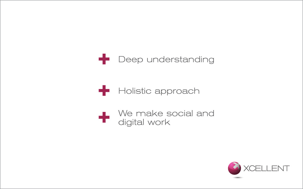
Let’s try stacking them vertically. We’ll use our plus signs like they are a math equation, or maybe like bullets. But now the page just feels like it needs something.
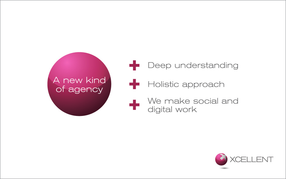
Perhaps we could bring the title back, but make it declarative and not a question. We could use the ball from the logo to ground it.
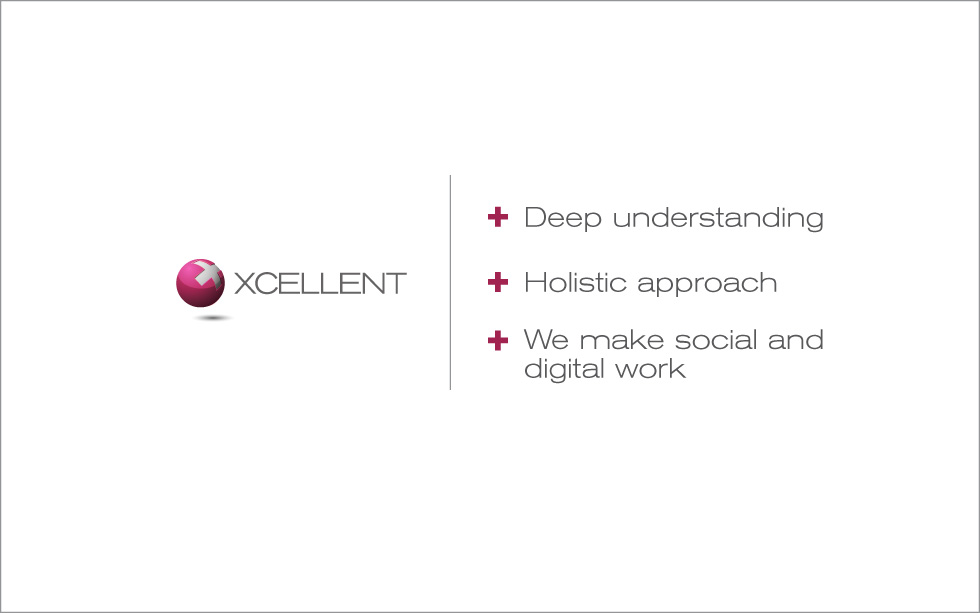
So this is getting there, but the content on the slide and the logo are in conflict at this point. Even though the logo is lovely as can be, I think it doesn’t belong in the corner. The ball, the bullets and the logo don’t work together. So maybe we loose the ball and replace it with the logo.
Now I like it.
So at the end of all this, our design isn’t a work of art, but we’ve added a bit of appeal. It’s easier to read and says something. Our presenter would say something along these lines:
Build 1: “We have a deep understanding of your challenges, the marketplace and the most cutting edge techniques.”
Build 2: “Your message can’t grow in a vacuum – We have a multidisciplinary, holistic approach that ensures consistent messaging and delivers on the promise of your brand. And it’s proven to work”
Build 3: “We make social and digital work for you, delivering heightened social engagement, globally aligned messaging and a measurable increase in your ROI.”
Lastly, we still want to do something with our “we are social” bit that we killed like a half hour ago. So we’ll do a soft lockup with the logo for a final slide. We keep the logo and line in the same position so things don’t jump around from the previous page to this one. We could leave a slide like this up on the screen while we grovel, beg and plead for the business.
As a quick detour: I have met people that design for slides based upon personal preferences or habit. They’ll say things like, “I always want a gradient in my text boxes – it looks more professional to me.” Or, “Things should always be left aligned, not center; I like it much better that way in every design.” These are valid opinions, but when your work is driven by these personal preferences, you aren’t designing any more, you’re formatting. Good design lets form follow function. The story should drive the content, and the content should drive the design. When the idea is clear it designs itself. But you must listen to what the design requires, not follow some rote method of working. Every situation is different.
The key to design isn’t to take what’s there and make it just look better, you have to look at the content and let it dictate your solutions. A complicated idea + design = a better looking complicated idea. A simplified idea designs itself as it has here. And that is xcellent.
