Picture the scene: a presenter standing in front of their audience, reading from a list of bullets on the screen. Even if the audience was interested initially, they’re tuning the presenter out before long.
The most frequent critique of this approach to presenting is to point out that, “you should try to avoid bullets.” (!) Or, “this slide should be more visual. Can you add pictures next to each bullet?” (!!) Neither critique holds a lot of water in my opinion. Eliminating the bullets, but not the text doesn’t make much difference. And adding pictures to a page of bullets doesn’t make the slide “more visual.” It just makes it more cluttered.
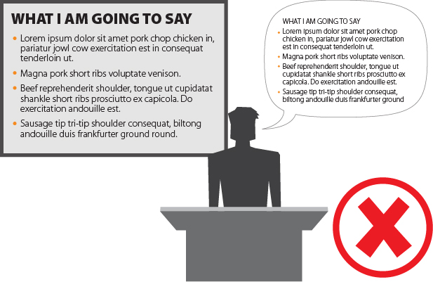
The mistake the presenter is making isn’t using bullets; it’s using so many of them – in front of so many words.
“But how can I use fewer words on the slide? I have a lot to say!”
How much you have to say is probably best saved for another post, but I’ll give you the quick rebuttal now: How much you have to say isn’t what’s important to your audience. It’s what they want to hear that matters. But that’s not the subject of this article, so back to the question…
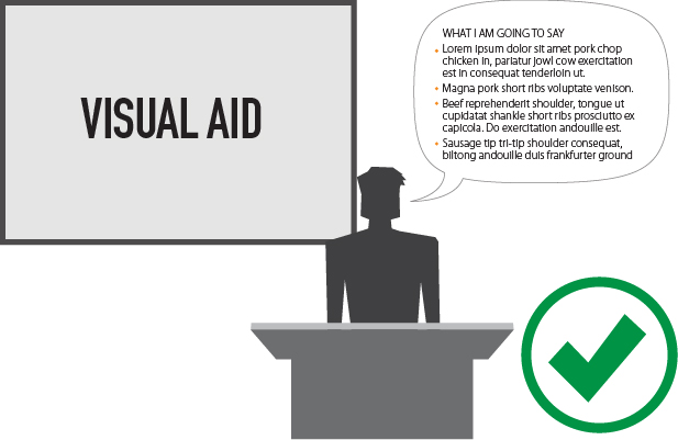
How do you use fewer words on the slide? The first thing to remember is that your slide is not your script; it’s a visual aid.
SLIDE=VISUAL AID
SCRIPT = WHAT YOU SAY
Your slide exists to support what you are there to talk about. If you are relying on your slide to guide you through what to say, it means you don’t know your material. This is no way to present! You should be able to speak extemporaneously about your subject matter. There are a lot of reasons to know your material, but the first 4 that come to mind are:
- Reading from a script is dry and canned
- It prohibits you from having a dialog with your audience – it’s a monologue
- People want to see your passion for the subject – it will keep them engaged
- You won’t be reading the audience’s reaction to know if your message is connecting
Don’t do this:
Let’s look at this another way:
Imagine going to the movies, buying your popcorn and sitting down in your seat. The lights dim and the music starts. Then, right up on the screen, is the screenplay, typewritten word for word, just the way the screenwriter typed it! This is what people who present their script are essentially doing.
In your presentation, you are the lead actor or actress; they are here to see and hear you talk. The slide is a supporting player. Your slide should never be a crutch, and it shouldn’t contain everything you have to say. It is a visual aid. Look for pictures or words that sum up what you want to talk about, and keep it at that.
Much better:
The reasons why people tend to put their script on the slide go beyond needing it as a crutch to remember what to say. Often, they haven’t found a way to simplify the idea. People also tend to wind up with slides that are a script because of the way in which they author their presentations.
The way you author?
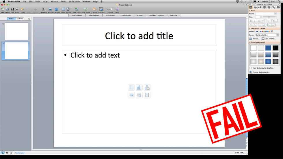
Sure. The first thing most people do when they have slides to author is open up PowerPoint and start typing. The first thing PowerPoint does is present you with a slide with bullets. Heresy!
The tool you use influences the thing you make with it. If you want to create a document, a document creation tool like PowerPoint or Word is the right tool. But what we want is to craft a story, then make visual aids. The strategies for doing this could fill an entire series of articles, so we won’t go into them here. But the short version goes something like this:
Start by mapping out your story with post-its, or on a white board. Then sketch your ideas out for each slide on paper. Then write what you might want to say, either in a word document, or in the notes pane in PowerPoint. THEN you can get to work on your slide.
Slides are often thought of as boring because they are being used for the wrong purpose. They should not contain everything you have to say. A script is a script. A slide is a slide. They are not the same. Make the story make sense, figure out what you want to say, and know how to talk about it without following a script. Then you shall be made free to make a slide that supports you, rather than props you up. Your audience will thank you. You might even thank yourself. Joy and approbation shall abound.


