Today I want to talk about hierarchy in design.
Hierarchy in design is the decision you make about what’s most important on the page and giving it the most weight. It’s about deciding what matters to your audience and what doesn’t. When you know what’s important, it’s easy to make design decisions. So here we have a case study with lots of screen caps, a few wrong turns, and a general explanation of my thinking.
How this started
Occasionally people bring presentations to me and ask me to “clean things up.” My usual response is that this isn’t necessarily the best way to approach things; the design must incorporate an understanding of the story. Generally speaking, cluttered slides are an indication that the author has yet to find the simple, powerful idea that should be at the heart of their presentation. So my approach is to work with the team to create a better story before tackling design. Once the story makes sense the slides pretty much design themselves.
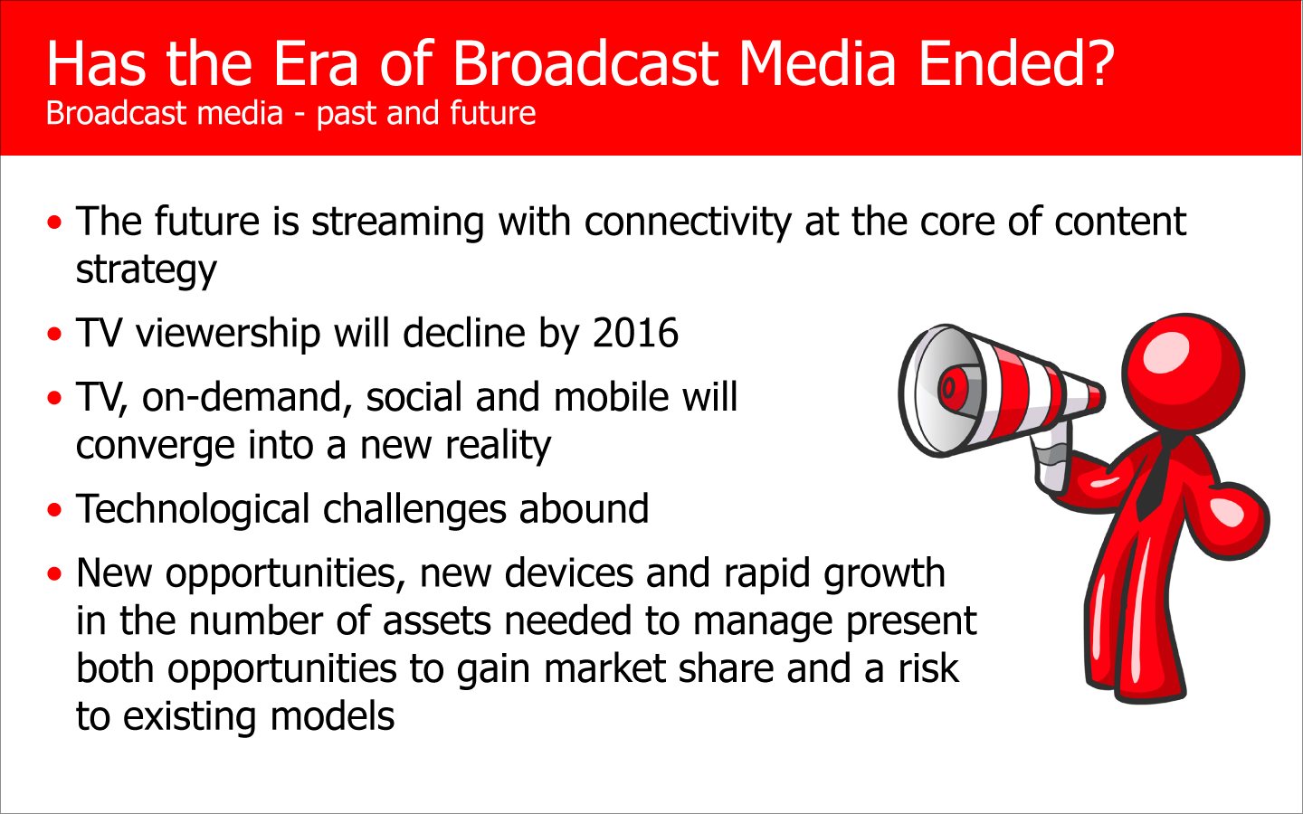
So here is a heavily sanitized slide from one such presentation.* The general subject is about the changing nature of broadcast media, and though it’s not written about explicitly, the implications for advertising.
So where to start? The title is much too long and lacks punch. The title also isn’t exactly about the content (or maybe it’s the other way around). The author seems content to present a list of bullets. (!) And someone must have decided the way to make the slide be more visual would be to add some clip art. (!!)
Let me refute that last one right now: adding graphics to a cluttered slide doesn’t make it more visual – it just makes it even more cluttered than before. And why should this be your objective? It seems likely the author felt that adding the cute blob person was a way of concealing the fact that they were presenting a list of bullets, or at the very least, a way of improving them. A simple, visual slide is the best way of getting your point across, but adding clip art is more of a step in the wrong direction. A slide should be a visual aid, not a script of what you want to say. This slide is a crutch for the presenter.
A crutch?
Yup. If you don’t have a thorough understanding of your story, your slides become a crutch to help you remember what to say and even to avoid the appearance that you aren’t bringing a solution to the table. Know your material well. Have a simple, powerful idea. Then be prepared to speak about it without reading from a script or from your slides. Then your presentation can become a dialog, which is how you win.
But this is supposed to be about design, so let’s get back to it.
As we evaluate the existing slide we want to understand what’s important as a clue about what to do. But the hierarchy isn’t well established here. Ideally, you can clearly identify the most dominant (and most important) thing on the page, but in this case it’s tough to tell. My money is on the blob person, which holds slightly more weight than the title bar. The bullets are 3rd and the subtitle is 4th. So our hierarchy is all messed up. No way should the clip art be more important than the title. And, if it actually did deserve to be the most dominating thing on the page, why would we then tuck it down in the corner? So our design doesn’t agree with our hierarchy.
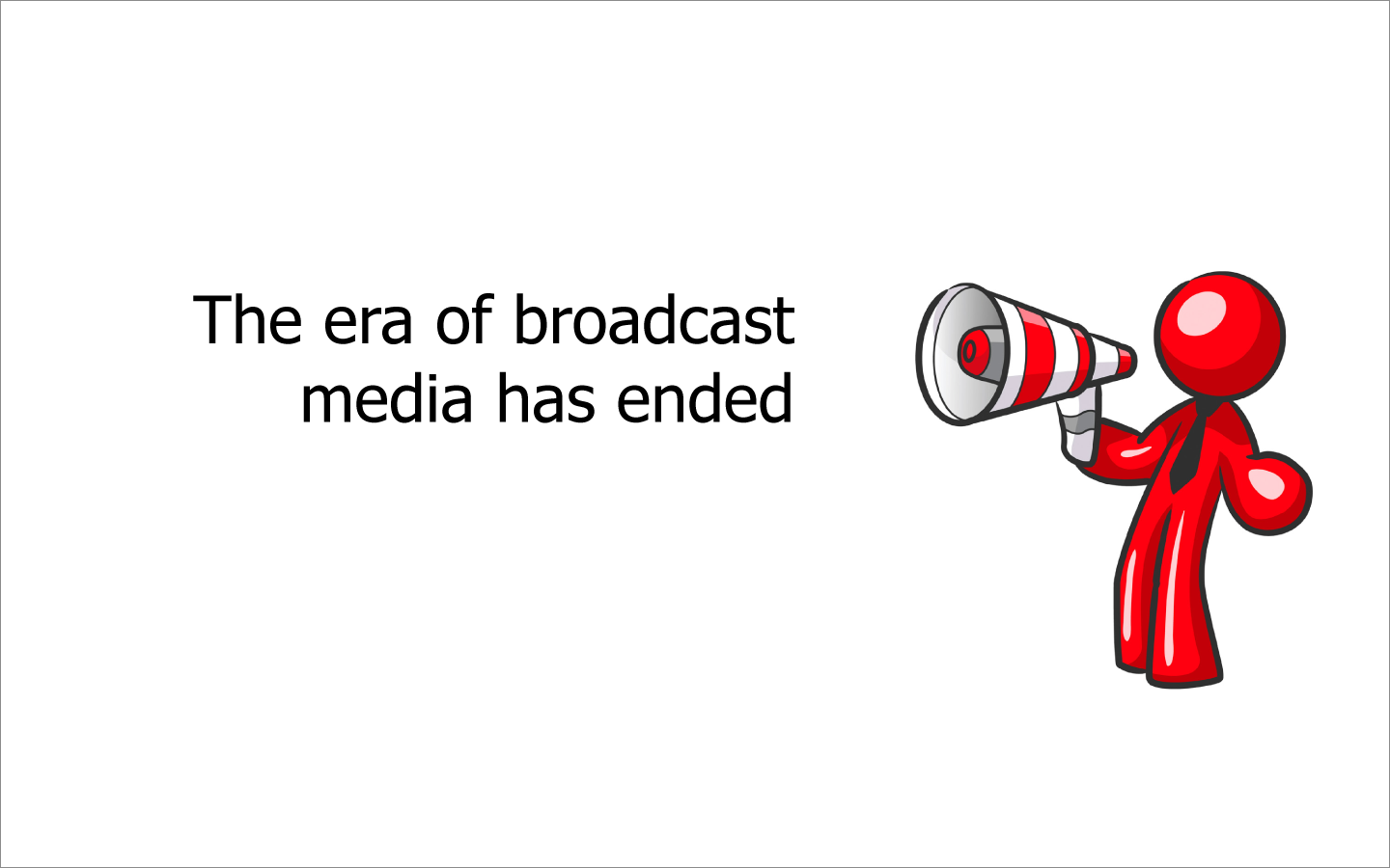
The bullets are something that anyone that knows their material should be able to talk about extemporaneously. You don’t need them on the screen. So we’re killing the bullets. And the title should be declarative. Be certain of yourself! The subtitle has no meaning whatsoever, so we’re killing that too. I hate the clip art, but we’ll get to that in a second. Already, we’ve improved:
Now you have a visual aid. Not a very good one. But still, it’s now a visual aid. The hierarchy is still a bit screwy. The blob person is dominant, even though it shouldn’t be, and the layout is forcing the eye to go right to left, when our natural inclination is to go left to right.
I also have a problem with the language. “Has ended” is declarative, but kind of wimpy at the same time. So let’s say, “is dead” instead of “has ended.”
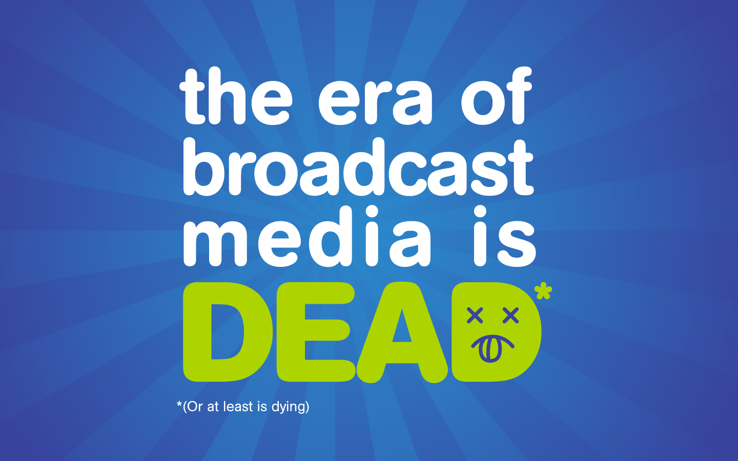
However, either way, I’m not sure it’s maybe not a bit of an overreach. (For the opposing viewpoint, by the way, check out the Ad Contrarian.) Let’s temper it with a footnote and say “the era of broadcast media is dead (or at least is dying). We’ll kill the cute blob person and add a bit of color. Before we lay this out, ask yourself, what’s the most important thing on the page? Now that we’ve gotten rid of the blob person, I say it’s the word “Dead,” which is where the impact lies. So let’s think about our hierarchy and make it bigger.
So just the text is interesting on the orange background, but let’s try it another way and add a bit of interest in the “DEAD.”
Better. The faint starburst pattern helps make this a bit more dynamic. But there is no emotional impact here. The words on the slide are a great discussion starter and are provocative, but we want our audience to feel something.
Let’s look for an image that conveys our meaning.
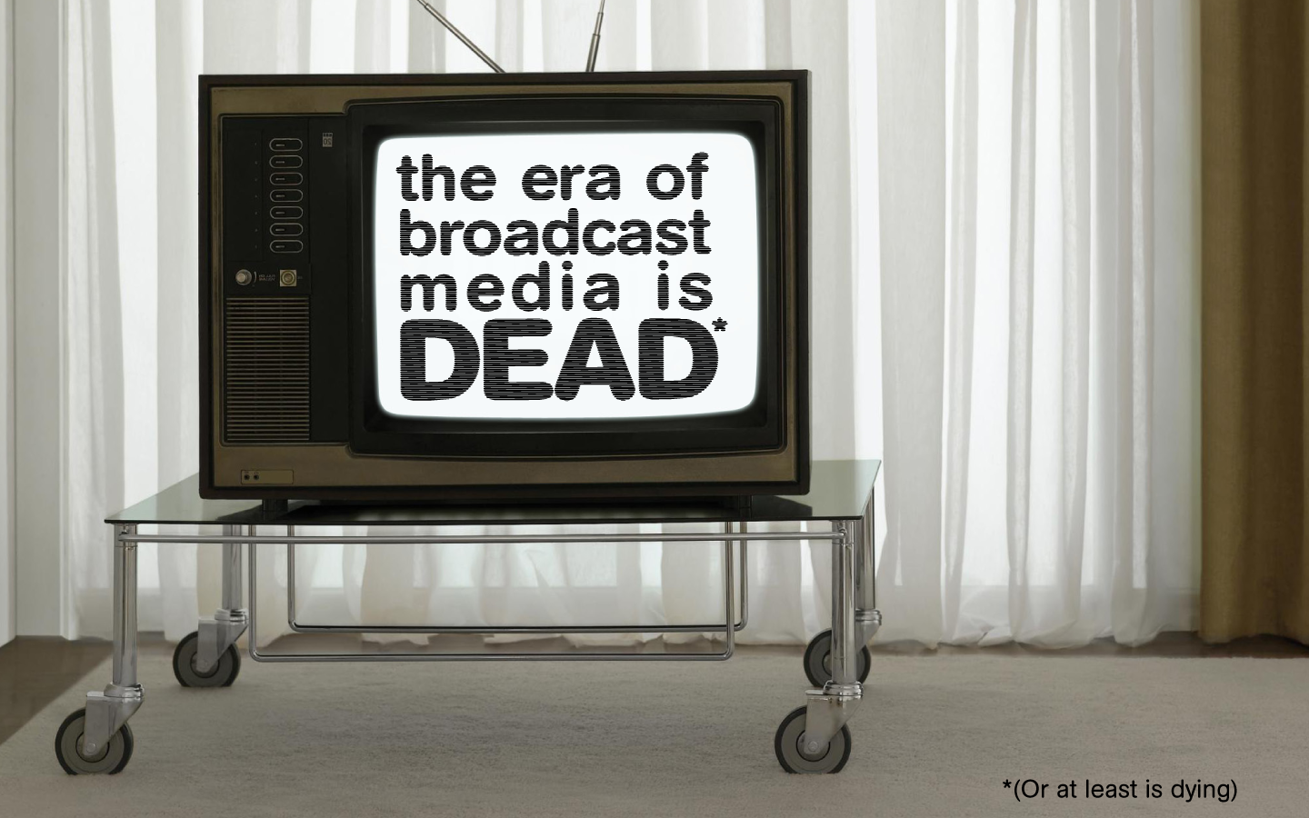
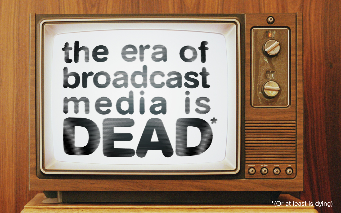
Here’s one, but the type is too small. I love the dated décor and old looking television, but the text is lost in the composition. If we judge the hierarchy here, we would think the curtains are maybe the most important thing. This totally blows. But the TV idea is worth exploring.
Here we have another funky, dated looking TV. The text is larger, but the wood paneling on the TV and background are still too dominating. Plus, the kitsch factor in the wood paneling might be lost on the audience. If the era is really dead, maybe we need a more edgy image. Maybe something with a smashed or discarded TV.
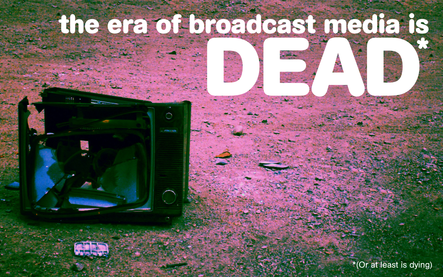
This is a cool looking photo with a nice cross-processed effect, but the TV competes with the headline a bit. The contrast doesn’t really set the title up as the dominating thing on the page. Plus the eye doesn’t really know where to go when you look at this. The human eye wants to go from upper left to lower right on a page. But here we’re almost asking the viewer to go from lower left to upper right. Not good. I could maybe flip it, but the thing is, the background is cluttered enough that it makes the text not stand out as much as I’d like. I want the text to be the dominant thing on the page and everything else to work in support of it.
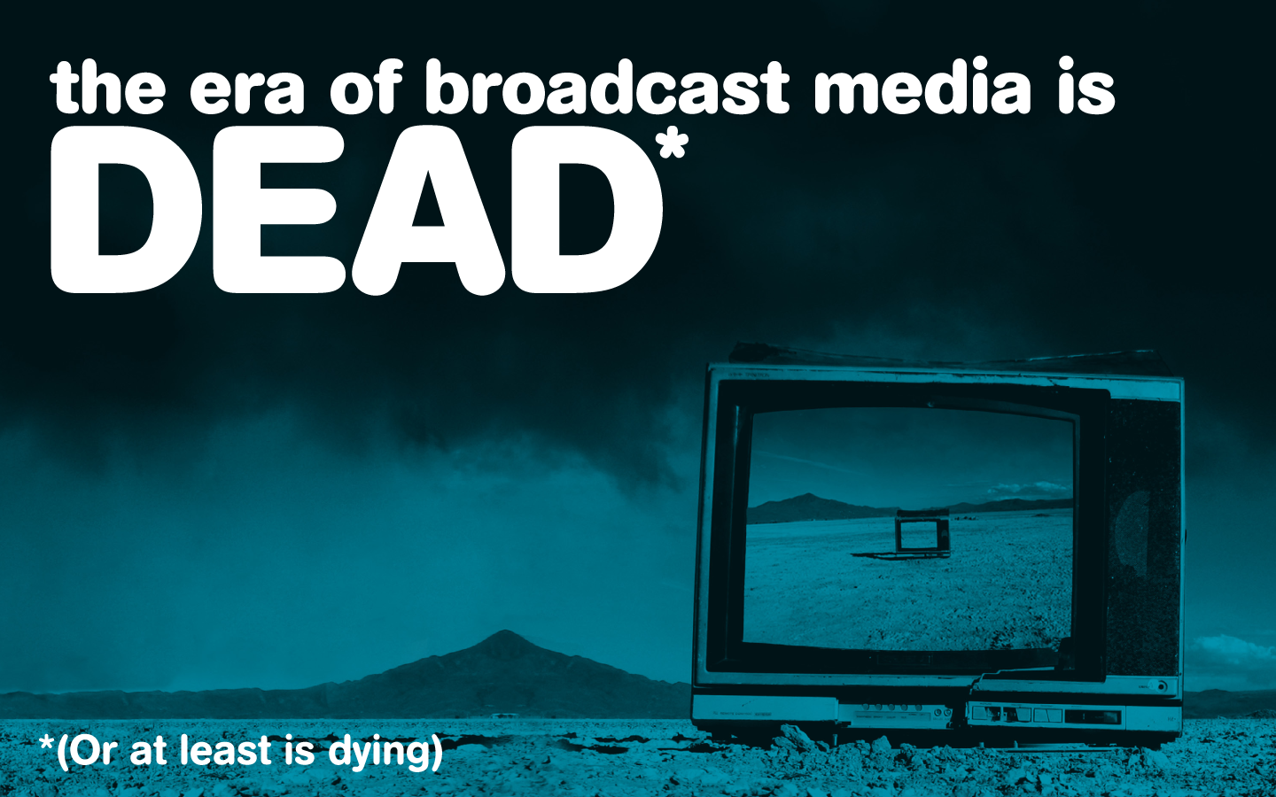
Here’s one that we made into a duotone which makes the KO type really stand out. The cloudy sky sets the type up nicely as the most important thing on the page, and the darkness of the TV is a strong 2nd place in our hierarchy. Just what I was looking for. I’m not sure what the TV in the TV is all about, but at this point I don’t care. We’re coming up on 1400 words now (and now we’ve past it), and I’m ready to move on to other things. I’m making the footnote a bit bigger because it’s not exactly a footnote anyway, just a way less important thing in our hierarchy. The page reads from left to right, with the most important thing occupying the most important real estate. The fact that the TV is at a bit of an angle actually helps our composition.
Adding images to a busy slide doesn’t make it visual. To make it visual, you have to make your story be simple and powerful, make your slide be a visual aid and not a script, and think about hierarchy in your design. The final output is no work of art, but it empowers the presenter to communicate with their audience, not read a bunch of bullets. The era of broadcast media might or might not be dead, but the era of good presentations is still taking in oxygen.
*While this is based on an actual project, it’s been scrubbed enough that I doubt the people that worked with me on it would even recognize it. What we have in common with the original is the use of clip art and bullets as well as the general voice of the author.
